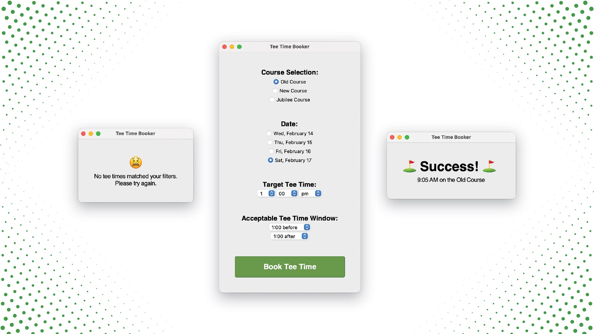
Hey! I’m glad you found your way to my website. Whether you’re looking for software development insights or looking to hire me for your next project, thank you for finding your way here.
This site currently serves as my digital resume for anyone interested in hiring me or stalking me to crack my bank account security questions. For contract work, please contact me over at TheBatemanAgency.com. A lot of my portfolio is cross-listed over there, but this website has a handful of additional personal projects.
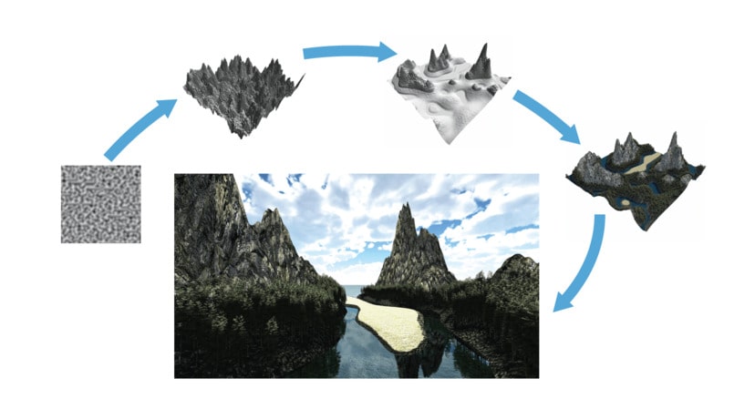
I’m a Charlotte, NC software engineer particularly interested in computational creativity, perception, and natural language processing (NLP). Formerly working in the creative industry, I’m interested in how things are communicated – especially how things are communicated to and from computers.
I first learned to program when I was an animator using JavaScript expressions. The rest is history. Since those days, I’ve launched a tech startup called Nyfty and helped clients all over the world with their technology projects big and small.
Thank you for looking through my portfolio and please don’t hesitate to reach out if I’m able to help you on your next project.